Because of new changes in its leadership and strategic plan, The Boston Foundation wished to update the brand to represent the organization’s new direction.
equity at the center
We modernized the brand, recognizing both TBF’s strength as an institution in Greater Boston and its dynamic efforts to move Boston toward a more equitable future.
Based on cultural, location, audience, and landscape insights, we came up with the brand truth, “Move Equity, Move Boston,” to inspire mobilization toward real, systemic, and transformative progress.
a plan for progress
Through online surveys, we found that messaging focusing on equity, collaboration, the long-term vision, and being informed by research strongly resonated with both current and prospect supporters.
a logo with legitimacy
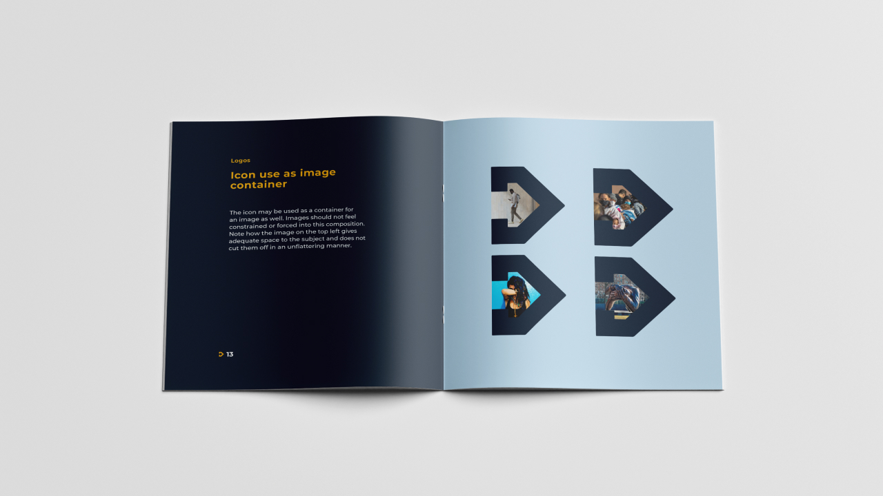
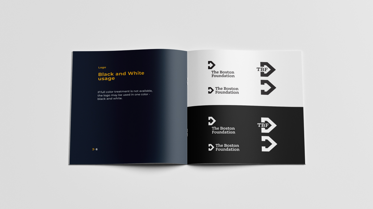
The logo was born of the brand truth “Move Equity, Move Boston.” The icon itself creates a sense of movement through the use of two arrows, the outer purple arrow and the arrow created by the whitespace inside.
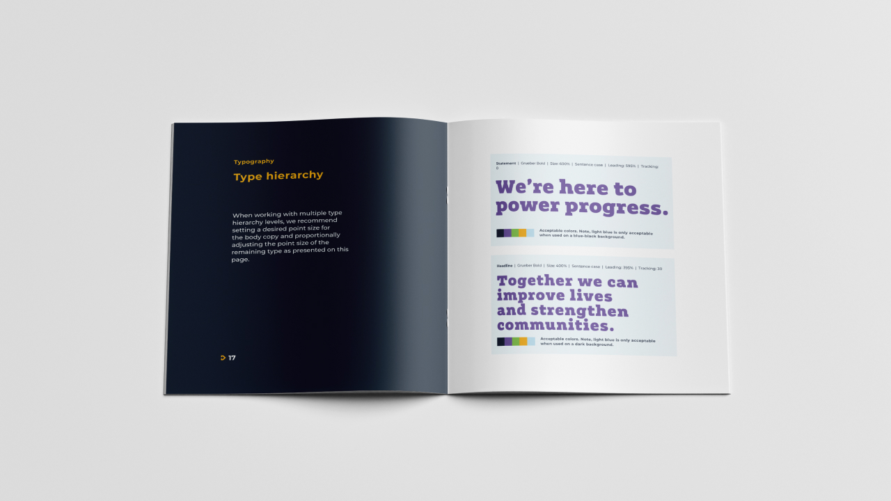
The use of slab serif typeface gives the logo a grounded, weighted, confident look and feel. The typeface reflects the institution’s overall brand and credibility.
this new brand represents our unwavering foundation-wide focus on equity to improve lives and strengthen communities
m. lee pelton, president of the boston foundation
in the press
newsworthy
The Boston Foundation
The Boston Foundation unveils new branding to reflect the reshaping of work around equity